BLOG
We’d like you to get to know us a bit better so welcome to the news,
reviews and insights from the Mansfield Monk team.
We’d like you to get to know us a bit better so welcome to the news,
reviews and insights from the Mansfield Monk team.
Once deemed ‘hippyish’, scientific evidence for the effect of colour on our behaviour and moods, or “chromotherapy”, is growing. The evidence shows that our perception of colour has a profound influence on our minds and bodies.
During the sixties and seventies a series of experiments found that green, white or blue painkillers weren’t as effective as red ones and that red pills make more effective stimulants than blue pills, while blue sleeping tablets are more effective than orange ones. Surprising perhaps then that there were no painkillers or stimulants, only placebo pills and the test subject’s colour perception. Likewise, studies have shown that football teams wearing red are statistically more likely to win than those wearing other colours and that male volunteers shown photos of women on red or white backgrounds were more likely to rate those on a red background as more attractive. People living near the equator tend to prefer brighter colours and gamblers place higher bets under red lights than blue ones but where does our colour perception come from?
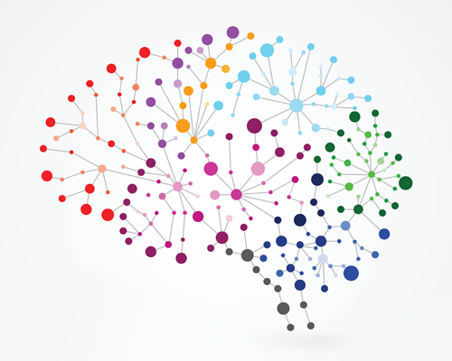
Human vision is trichromatic; we have three colour receptors, or cones, in our eyes which pick up different wavelengths of light: red, green, blue. Most colour blind people have two meaning that they only detect green and blue wavelengths as do most mammals barring a few of the ape species. In fact, it is only 30 or 40 million years ago that the third colour receptor developed as a product of evolution: until the demise of dinosaurs mammals were largely nocturnal creatures darting around in the dark to avoid these considerably larger predators. It was only once our early ancestors began to come out in daylight that our trichromatic vision developed and how we interpreted the wavelengths of light in to colours changed from merely telling the difference between day and night.
Our colour perceptions are based partly on our evolutionary history and partly on our individual cultural history and context, the former being a more inbuilt, animalistic response: the yellow and black of a wasp signalling danger, red stimulating the appetite both for food and sex and green calming due to its association with nature. In terms of context, a 2011 study showed that people who’d been asked to disclose something unethical they’d done judged a room darker than those who’d recalled something ethical, showing that even feeling morally compromised can affect your individual colour perception!
So let’s have a look at the best interior uses for colours in their more generic terms;
Purple
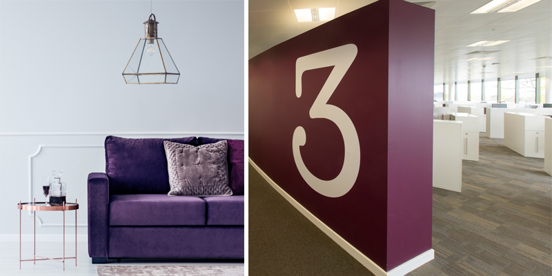
Purple is thought to encourage creativity and imagination but also gives a regal look suggesting luxury and bringing a real presence to a space. Consider using it for an entrance area such as a reception or hallway for maximum initial impact.
Blue
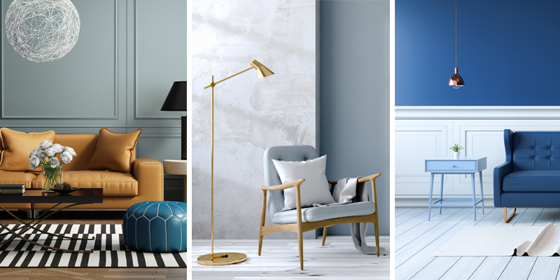
Generally accepted as a calming and soothing colour pastel blues are best used in bedrooms and waiting areas such as receptions. In darker hues it is thought to be a productive colour, stimulating thought and concentration so is also effective in work and quiet study areas.
Green
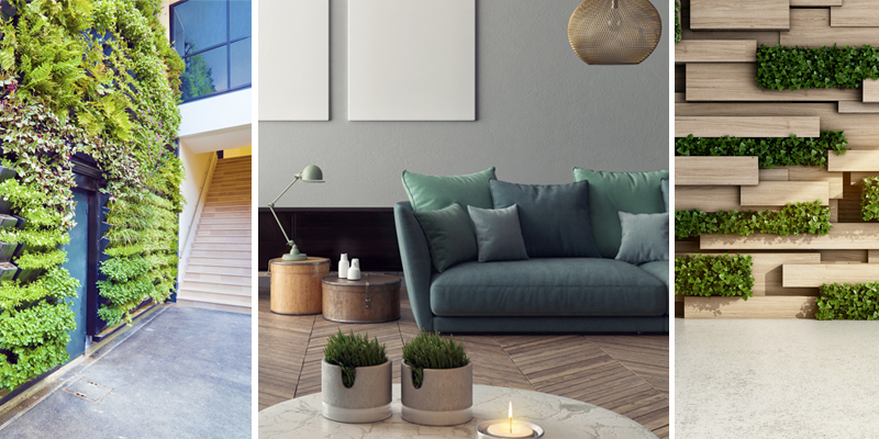
A positive colour, green soothes and encourages mental relaxation and in deeper shades stimulates thought. Green was Pantone’s colour of the year for 2017 and, as the trend for all things biophilic shows no signs of slowing, can used throughout the workplace or home in the form of plants to bring nature and wellbeing indoors.
Yellow
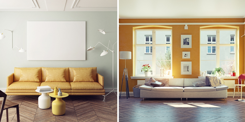
Increasing liveliness, yellow is an emotional colour: in certain hues it uplifts energy and encourages innovation but can be overstimulating and evoke anxiety in some so should be used mainly as an accent colour. This year’s trend towards metallics mean that golden yellows can be used to give a ‘luxe’ feel to an area.
Orange
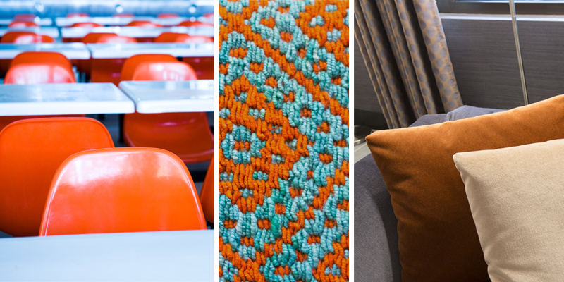
An energetic colour, orange is said to encourage activity and stimulate conversation, great for a meeting or town hall area in the office or in the kitchen and living areas of a home. Read our blog next week on trends to find out how orange will play a role in interiors in 2018!
Red
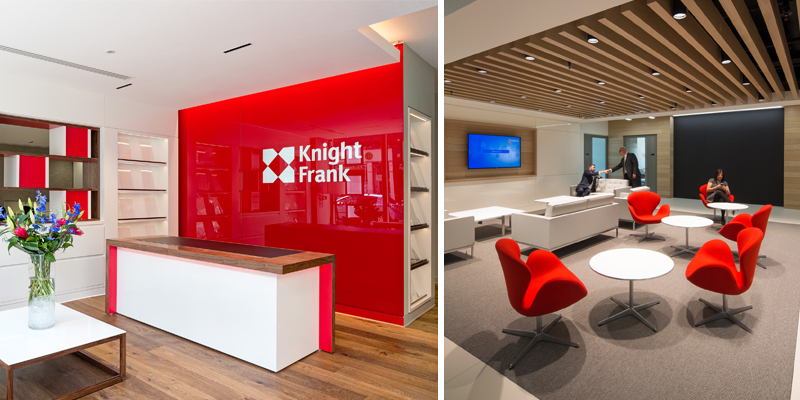
Prompting sociable and lively feelings and stimulating appetite, red is a perfect contender for a dining and breakout areas. Its best used in moderation though as it can be an overwhelming colour, prompting headaches if used excessively. Darker shades can provide a rich, traditional feel to an area.
Pink
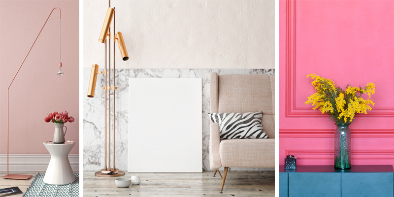
Pink is a calming, soothing colour that lowers the heart rate more significantly than other hue. With Graham & Brown choosing ‘Penelope’, a dusty rose colour as their 2018 colour of the year, pink is bang on trend for areas such as bedrooms or quiet spaces.
Black, White, Grey
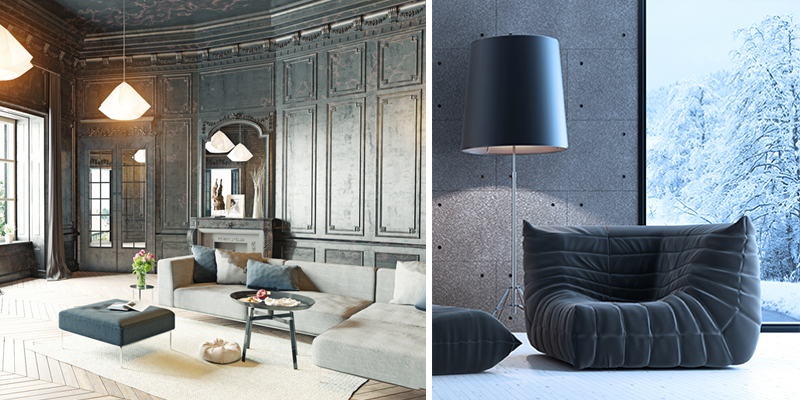
The most versatile colours, neutrals can have a dramatic impact used solely and can give the impression of stability, calm and security. The most useful colours to provide a backdrop to accent colours, neutrals can literally be used anywhere.
Our competition to win two tickets to a colour workshop event in London with special guests Pantone Colour Institute in partnership with Milliken Europe is on! To enter just go over to our pinned post on our Twitter account here: http://bit.ly/2FSw0Qn T’s & C’s apply!
Next week we’ll be looking at future colour trends as part of our #MMInColour2018 campaign.